20 Inspiring Creative Agency Portfolio Page Designs From 2017
For a design agencies, your website is one of the most powerful weapons you have. It’s a great tool to showcase your skills, creativity, and imagination to your potential clients.
Clients often use the design and user experience of your agency portfolio to determine how talented you really are. So it follows that most creative agencies do their best to come up with a unique design for their portfolio page (and regularly update it to win more clients).
If you’re planning on building a new portfolio site for your agency, or revamping your old website, here are some of our favourite portfolio websites for your inspiration!
HeadOffice

Did we just stumble onto a website powered by the classic Mac OS System 7? Nope. This is actually the website for the UK-based creative agency HeadOffice.
At first sight, their homepage design will remind you of a desktop screen from an old computer. Almost all elements on the website are fully interactive. When you click on an icon, it will open up a new page in a new (PC-style) window. You can also restart or switch to sleep mode. You can even drag those icons around the page. How cool is that?
The only downside is that the website is a little slow, just like an old computer. Who knows, maybe it was intentional?
We Are Young Blood

This US-based creative studio uses quite an interesting website design that’s both a little weird and remarkable. At the homepage, you’ll see a fast animation showing some of the agency projects appear one by one compiling into a beautiful collage.
The website also uses a side-scrolling design that allows visitors to explore the agency portfolio easily without having to load any other additional pages. A particularly nice touch that improves the user experience.
Big Youth

Big Youth is a French design agency with an amazing portfolio that includes projects for giant companies such as Ferrari and Kenzo. Their website also lives up to their reputation.
Just as their name implies, Big Youth uses big bold headlines and large images throughout their website to grab the attention of the visitors. It also uses nice animations on all pages to entertain and delight.
Cappen

The US-based creative agency, Cappen, has a unique portfolio website that nicely captures their core concept of being adaptable.
The homepage of the website doesn’t feature a lot of content. You’ll only see the company logo and a series of adjectives that describe what the company is “born to be”. It almost seems normal, until you click and hold your mouse. When you click with your mouse on the homepage, it will show a quick video clip for each adjective showing how creative the team behind this agency can be.
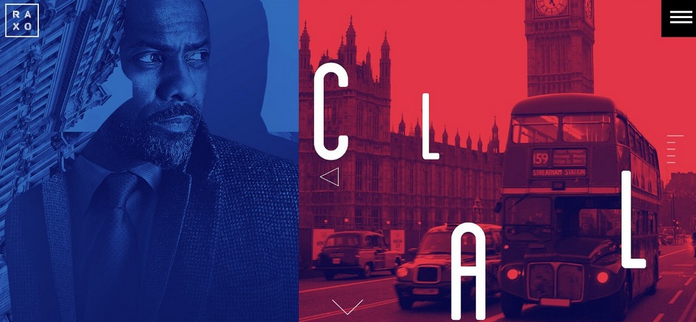
RAXO

The US-based design agency RAXO’s portfolio page contains nothing but giant images that direct you to each project case study. The hamburger menu on the homepage also only contains 5 links featuring large text. It’s simple, elegant, and effective.
Yoocon

This creative agency in Germany uses a unique design that allows you to explore their portfolio through a side-scrolling website, by simply clicking anywhere on the page.
When you move your mouse cursor to the right side of the screen, the cursor will change into an arrow to let you know there’s more to explore. A unique design approach that you don’t normally see on most other websites.
ToyFight
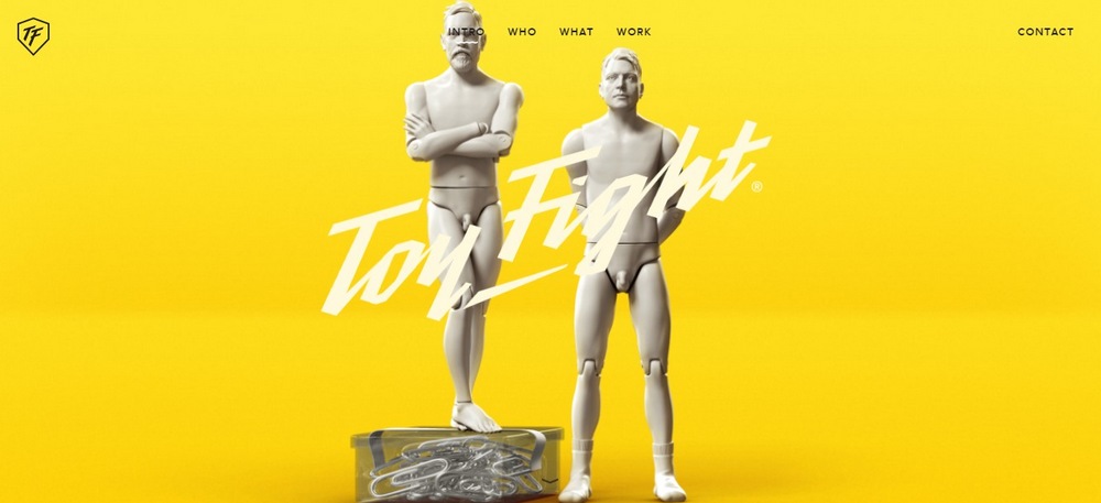
The website for the award-winning creative agency from the UK, ToyFight is the perfect example of a website design that effectively uses minimalism to send a strong message to visitors about the way they work.
The website contains a very small amount of text, and keeps color consistency throughout the design to match their unique portfolio. Everything about this portfolio design is admirable.
Kingsize

Does color make a difference in a website design? You should ask that question of this creative agency from Belgium. The website for Kingsize agency uses only a few colors. The website design overall is black and white and the colors only appear when you hover over the items in the portfolio.
MING Labs

The amazing loading animation is not the only smart thing about MING labs website. It also has a unique portfolio page with embedded videos that not only showcase the projects the agency has worked on, but also show how those designs work.
PELL MELL Agency

The French design agency, PELL MELL, uses an auto-scrolling full-screen slider on their homepage that showcases some of the best projects from the agency portfolio. The main idea of a portfolio page is to show off and this website does that job perfectly.
Mikmak Studio

This creative agency from France has a fascinating recipe for success. Mikmak Studio visualizes this recipe on their portfolio website through an interactive step-by-step animation. It’s truly entertaining to watch. What’s more interesting is how the animation reverses back when you click to go back to the homepage.
Point Studio

Point is a UK-based design agency that mostly works with startups. The agency uses a minimalist yet powerful design on its website to showcase its portfolio. You can either explore the website by scrolling down or browse a case study by clicking on the grid icon on the top right-hand side.
eTecc Interactive
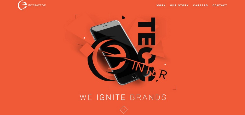
Sometimes, an old-school website design is enough to show off your agency portfolio, if you know how to do it right. The website for eTecc, a creative digital experience design agency from the US, doesn’t have a lot of fancy animations or unique design elements. The design is simple and ordinary, but they use it to their advantage to showcase their portfolio, services, and expertise.
Femme Fatale Studio

Some say that French are more talented when it comes to art and design. Looking at many of the page designs we’ve featured above, you can see that it’s true. This is yet another example of how talented they can really be. This unique website design belongs to a French creative studio named Femme Fatale.
DUX

This creative interface design studio uses a very colorful design for its portfolio website that highlights the way they work. The website features a simple layout that nicely showcases the entire agency portfolio.
Method

The website for New Zealand-based creative agency, Method, uses plenty of Red to highlight its big bold text, which can be seen throughout the design. The intelligently placed animations also add a dynamic interactivity to the website.
Overpx

Creative digital studio from Italy, Overpx, uses a complex design on its website. Which is exactly what the agency was going for since they claim they “don’t like normal things”. Their portfolio page is quite fun to browse since it opens each case study in the same window without any page loading delays.
Significa

This creative agency makes the most use of white space on its minimalist website to give more attention to its portfolio and client testimonials, two of the things that are most important in convincing clients of your talents.
AllenDjal Inc.

AllenDjal is a US-based creative marketing agency that has a beautiful side-scrolling website to showcase its portfolio. The entertaining curtain-pull scrolling effect makes it truly fun to browse through this portfolio website.
Reputation Squad

This creative agency specializes in augmented influence and they use their website to show how creative and talented they can be. Their website contains a highly interactive design. The agency tells an interesting story by taking the visitors on an interactive journey. You’ve got to try it to really appreciate it!
Did we miss any other great portfolio websites? Let us know in the comments.