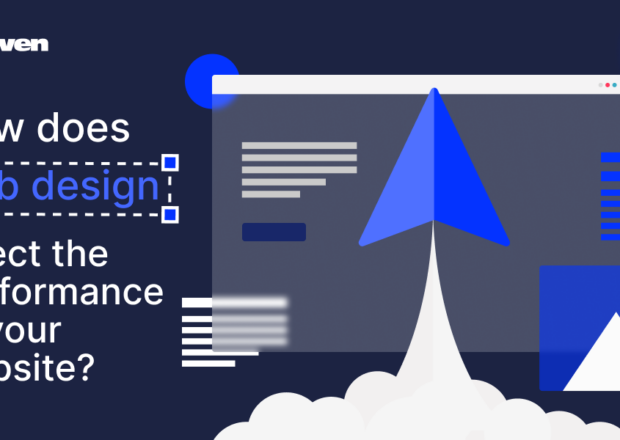
Building a beautiful, modern front-end design requires more consideration than ever before. From user experience, to bold visual elements, to animation — there’s a lot to think about. It’s also more exciting than ever. New technologies and more powerful browsers give you greater flexibility than ever before.
All of the parts of a website that users actually touch and interact with are part of the front-end development. So, it’s important to get right! Here are a few tips and techniques that can help you design an interface that stands out from the crowd.
1. Make It Modern
A good website starts with a modern interface. This includes a design that features elements in current styling, a trend or two, and a fully-responsive interface that works seamlessly across devices. (While this might sound obvious to some, there are still a large number of websites out there that don’t meet these simple criteria.)
When it comes to a modern design, start with simplicity. It’s hard to go wrong with a classic design style that includes plenty of white space, a bright color palette, and flat (or somewhat flat) elements. Set a goal for each page, and provide a clear call-to-action for users so they’re guided in a sensible path through your design.
Once the basics are in place, you can add more touches of personality. Video, animations, you name it. But here’s the one guiding rule: keep it simple. That classic mantra should guide every design decision. Don’t add anything to your front-end design that doesn’t serve a purpose.
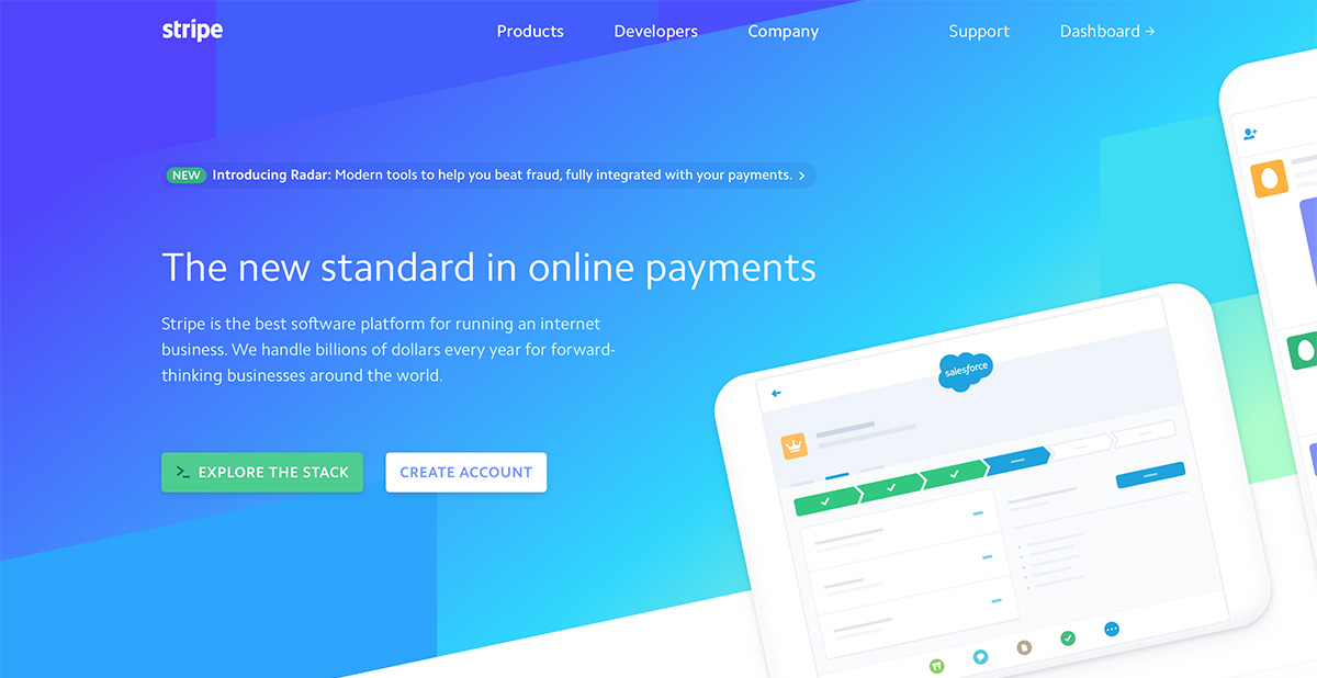
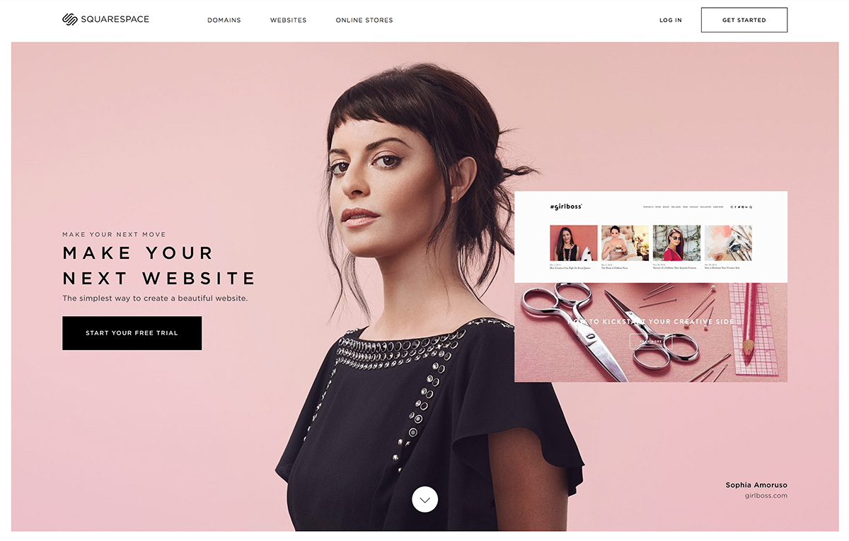
Stripe is a great example of a bright, bold, and modern design.
2. Incorporate Strong Visuals
If a visual element isn’t great, leave it out. Strong visuals are the key to drawing users into the design. Photos, video, illustrations and animations should be sharp, precise and of the highest quality. A single poor visual element can ruin a design, even if every other aspect is well thought through.
The good thing is that you don’t need a huge collection of these elements to make a design work. Pick one or two great visuals and go with them. Use an oversized photo or video to make a solid first impression, or incorporate a simple animation to surprise and delight users.
File selection is important. Use well optimised high-resolution photographs, vector-based files for illustrations, and SVG or CSS for image-based icons and user interface elements. Optimise everything! (A tool like TinyPNG can be great for this.)
3. Focus on Typography
A readable website is a usable website. Focus on typography that users will enjoy reading.
While complicated, novelty lettering can be a lot of fun, the best typefaces for website design are easy to read at a variety of sizes. Type should be thick enough that users can understand the meaning with a glance, but not so thick that the words scream from the screen.
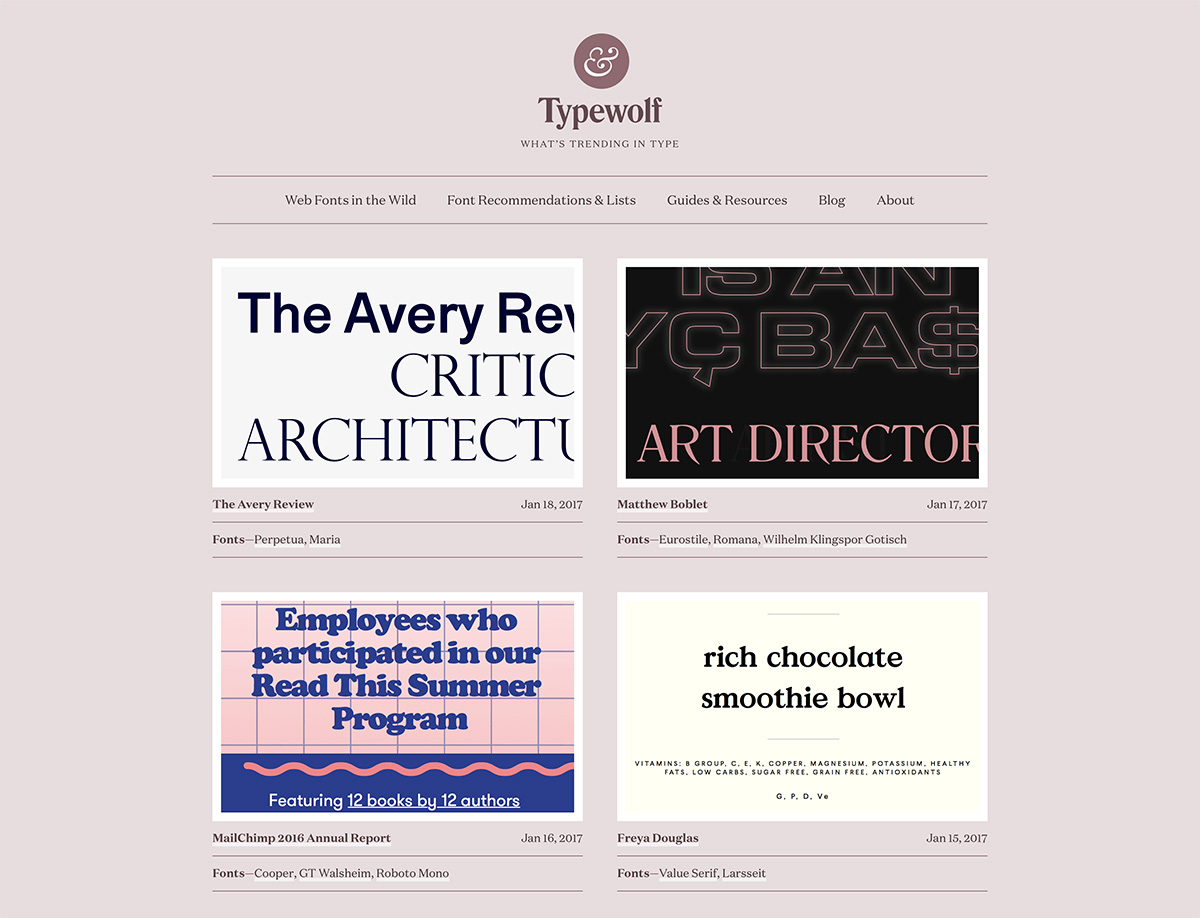
A simple, medium stroke width serif or sans-serif option is a good place to start. Pair a headline and body combination of opposite style for even more interest. And then stick to that palette. You don’t need more than two or three typeface families to get started. Projects like Typewolf are a great place to find inspiration.
4. Animate with Purpose
Thoughtfully animated elements can really set the best designs apart from the rest of the pack. From tiny hover actions, to elements that move across the screen, to engaging parallax scrolling, animation is a must-have aspect of a modern interface.

Animation can help draw users in and provide an extra source of engagement to keep them with the design. Animation can be subtle and provide an “ah-ha” moment for users, such as with a color change hover effect or moving user interface element. Or it can serve as a central theme in the overall design concept.
5. Be Obvious

One of the biggest website design traps is over-complication. In your effort to do something new, the design and user interactions get jumbled and hard to understand. You shouldn’t have to think about how to use a website; it should be obvious.
Use common user patterns and flows. (It’s no coincidence that navigation is often at the top of a page, and the shopping cart icon on most websites looks the same.)
In most cases, design from top to bottom and left to right. Use visual cues such as size and spacing to help users understand where to go and what to do. Make sure clickable elements, particularly buttons, look like they should be clicked. When in doubt, remember: keep it simple.
6. Enlist a Professional

Can you envision exactly what you want your website to look like, from colors to animations, but don’t have the time or capacity to actually turn it into a functioning design? Mayven is here to help.
Designing is the first step. Aside from pen and paper wireframe sketches, your starting point really can be a simple design outline in Photoshop, Illustrator, or Sketch.
Our experienced software team will pick apart the mockup and return a pixel-perfect project, written in valid HTML5/XHTML/CSS so that your website is ready to roll. You won’t have to think about a single line of code. You won’t have to worry about how to make things work.
It’s sometimes the simplest elements in a website design that can be the most complicated for you to wrap your head around in the design process. From nifty animations, to obvious user flow patterns, to an overall “modern” design, there are several elements that can make or break the end result.
Follow these simple steps though, and you’ll be well on your way to having a design that you (and your client) can be proud of!