15 Tips for Creating a Great Website Footer
One of the most important locations on your website is the footer. Yes, seriously. It may not be the area of the greatest design or most impressive content but it is a place where users frequently look for information. So it is vitally important that you don’t neglect this area when planning a web design project.
But what elements should you include? How can you keep the footer organized and in line with your overall aesthetic without being obtrusive? You’ve come to the right place. Here we’ll look at tips for creating a great footer with examples of some websites that are doing it well.
2 Million+ Digital Assets, With Unlimited Downloads
Get unlimited downloads of 2 million+ design resources, themes, templates, photos, graphics and more. Envato Elements starts at $16 per month, and is the best creative subscription we've ever seen.


1. Keep the Design Simple
Yes, this is one of the keys to most design projects, but it is worth stating right off the bat. Simple design is important when working with a lot of information, which will likely be the case for a footer. Stick to clean elements, plenty of space and organize with purpose. Try to avoid clutter and think about what elements will live in your footer and why they should be there. Footer size is often related to the amount of information and number of pages on your website.
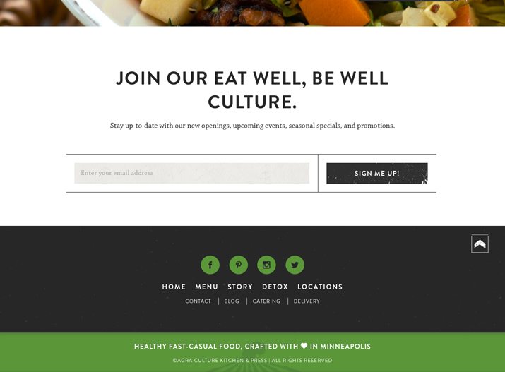
Agra-Culture uses color, icons and text in the footer but it is simple and has great flow. Every link is easy to click and the subtle detail with the farm image in the green box is a nice touch.
2. Link to Your Information
Two of the most important links in any website footer go to the “About Us” and “Contact Us” pages. Users will want to know who you are and what your company or brand is about. Make it easy to find that information. Many will also want to know about your team members and how to reach them. (This is a vital tool. Many people lose business cards and will return to your website to retrieve that contact information.)
Heckford includes plenty of links to the company, social media and information about their work.
3. Include Basic Contact Information
While you should link to a full “Contact Us” page, including relevant contact information in the footer is nice as well. Include a main phone number, email address and physical address. (Bonus points for setting each element up so that it auto dials, emails or maps when clicked.)
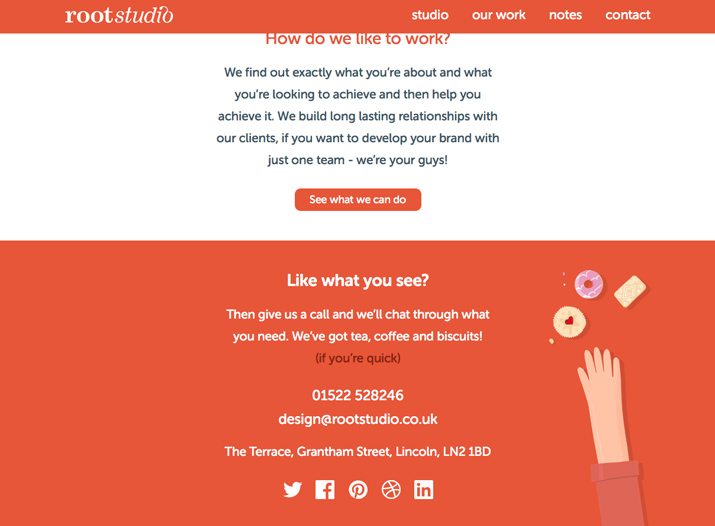
The Root Studio created a footer that almost goes against everything you imagine when you think “footer,” but it works. The text is large (as well as the box that contains it) and it is boiled down to a super simple list of contact information. (This is a n impactful design concept for a website that wants users to contact them for projects and work.)
4. Organize Footer Links
Grouping like footer items can create a nice sense of organization for links and information. Consider several columns (or rows) of relevant information such as contact, links, services, social media and sections from your most popular pages. Place each section under and header so that every element is easy to see and find.
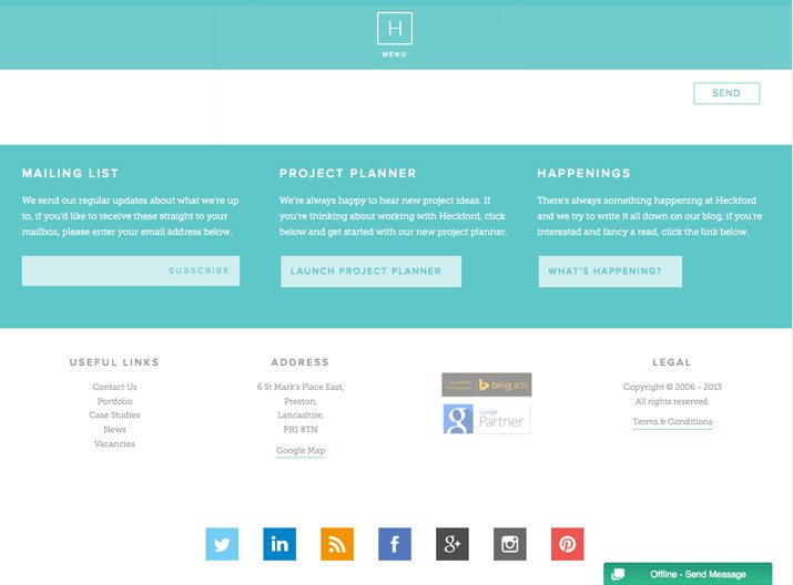
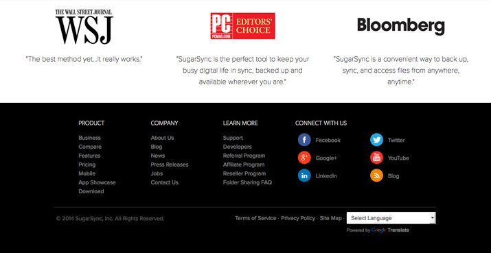
SugarSync includes multiple columns of information for easy access to footer information. With “Product,” “Company,” Learn More” and “Connect with Us” headers, it is easy to find the part of the site you want to use next.
5. Include a Copyright Notice
This tiny line of text can be a lifesaver. Don’t forget it. While most sites include it as a single line across the bottom of the screen, you can design it to be more integrated into the rest of the footer. A copyright notice can be written or include the small, circular “c” symbol. The text often includes the year of publication and name of the copyright owner. Multiple copyright notices can account for content and design (for sites that are partially created by a third party.)
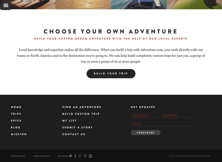
Adventure.com keeps it simple with a copyright notice at the bottom right of the screen. The information features low-contrast type so that it does not get in the way of more important footer navigation elements.
6. Include a Call to Action
Once users have navigated to your footer, give them something to do while they are there. Include a box to sign up for an e-newsletter or invite them to follow you on a social media channel. Don’t forget the value of this space in terms of converting clicks.
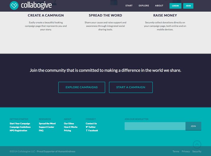
Collabogive dedicated a significant amount of footer space to “Join Our Newsletter.” This call to action is easy to see, fits the design and gives users a way to interact without necessarily joining a campaign.
7. Use Graphic Elements
Too often footers are just a block of type. Add logos or graphic elements for added visual interest. Just be careful not to overload this small space with too many elements. Think of it like this: Rather than spelling out “Follow me on Facebook/Twitter/whatever,” include icons for these outlets. You could also use small iconic elements for links such as maps or phone numbers (but you should probably include a hover state that has the information “spelled out” as well).
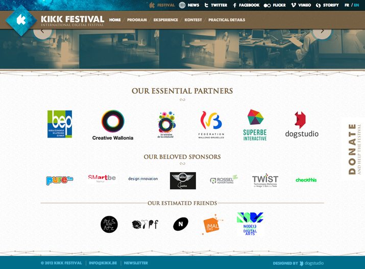
The Kikk Festival uses footer space to highlight festival partners using just logos and quick contact information. Note the size of icons – every one is easy to see and read – and use of a slider so that a large number of elements can be displayed in a small space.
8. Be Aware of Contrast and Readability
Footer information is typically small … very small. This makes thinking about color, weight and contrast between the text elements and background vital. Every word should be readable. Consider simple typefaces (sans serifs with medium weights are nice) and a touch more leading than you might typically use. Opt for colors with high contrast, such as a light background with black text or dark background with white text. Avoid using varying colors or ornate typefaces.
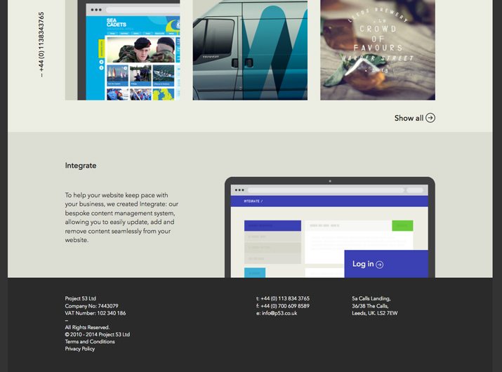
P53 uses one of the classic (and most readable) text and background combinations around for footer information – white on black.
9. Maintain Your Design Theme
The website footer should not look like an afterthought. It should match the overall design theme for the site. Colors, styles and graphic elements should mirror the overall tone. Don’t make the common mistake of adding a “box” footer that does not match. Think about this space and how it will be used from the start of a project to avoid getting stuck with a mismatched element late in the design process.
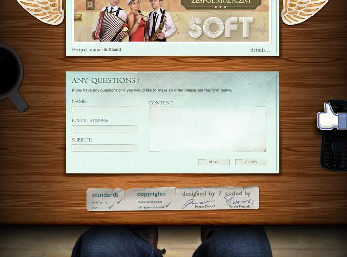
Swiths Interactive Group uses a simple footer that completely integrates with the overall look of the website, which features a person sitting at a desk with items strewn across it. The simple footer shows relevant information and looks like it belongs on the site.
10. Think Small (But Not Too Small)
Footers by nature include a lot of small items. Just be careful not to go too small. Text can be a few points small than the size used for the main body of the website. Icons or images need to be readable at the size you choose. (If you can’t tell what the icon is, it’s probably too small.) Elements must be large enough to easily click or tap. If users can’t access the links because they are too small or too close together, they will not work as intended.
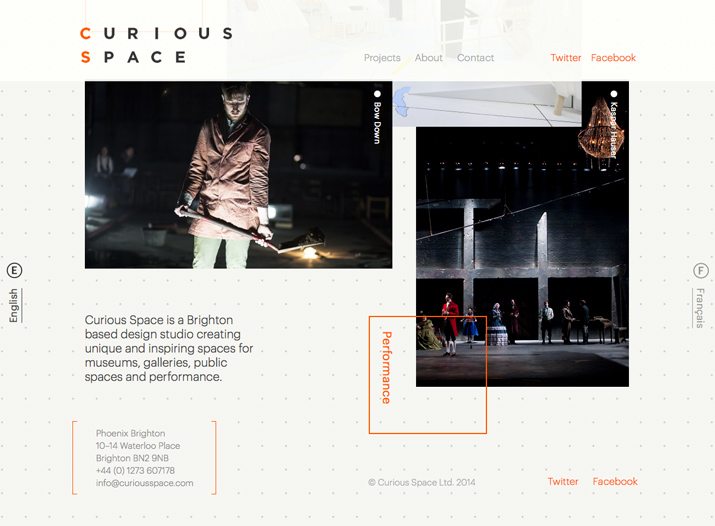
While Curious Space uses a quite non-traditional footer style, you can get a good sense of scale from the type sizes used. Footer text is a bit smaller, thinner and lighter than all of the other copy on the page, but still large enough to read easily.
11. Use Plenty of Space
Because footers typically live in tight locations, space and spacing is important. Leave plenty of room around elements in the footer as well as between lines of text. Adequate spacing will keep the footer area from looking cramped or uninviting. It also goes a long way toward click- or tap-ability. Since many (if not all) of the items in the footer are linked to something else, this is an important aspect of user function. The amount of space you use does not have to perfectly mirror spacing on the rest of the site, although it can. (This is especially true for sites that use tight spacing in the main body of the site for a specific effect or impact.)
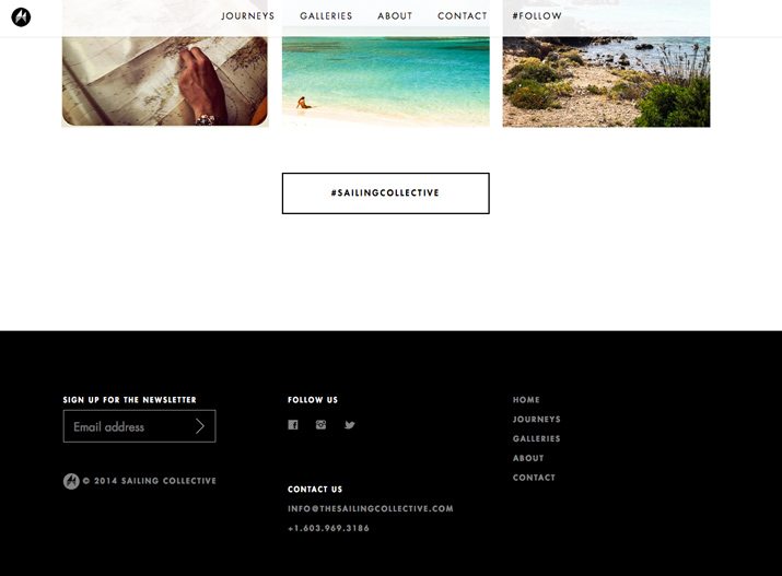
Sailing Collective uses plenty of space vertically and horizontally between elements. They are clustered by type and clickable.
12. Be Wary of Too Many Objects
While using graphic elements and headers is a good idea, there is a line between just right and too much. Use these items sparingly and for a very specific purpose. Ask yourself why you are using a header, icon or photo. If the answer is “because it looks good,” reconsider it. Every element should serve a purpose. This will help you design a usable footer that makes good use of the space available.
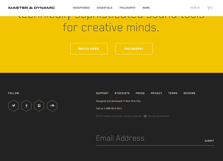
Less is more as you can see from the footer for Master & Dynamic. Simple icons and text are enough to get you through footer content with ease.
13. Create a Sense of Hierarchy
Just like the rest of the website a footer should be hierarchical in nature. This is a two-fold design. The footer should fall at the bottom of the overall site hierarchy. (That is where it is located after all.) The footer should also contain a hierarchy of elements within its “container.” The most important elements (often contact information, call to action or site map) should be the most prominent. Standard information, such as the copyright notice, is often the smallest in scale.
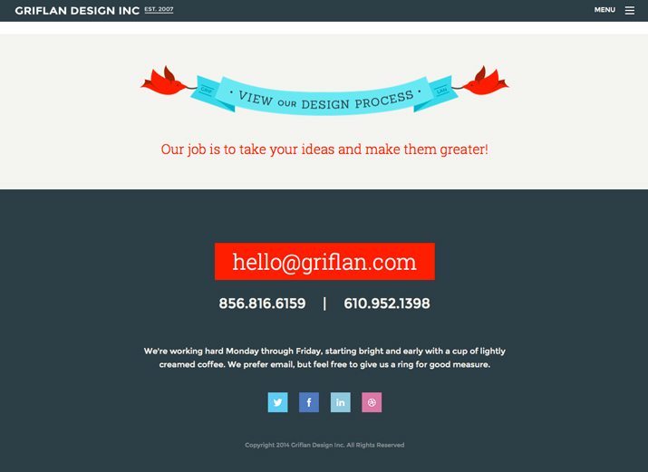
Griflan Design Inc. tells users what to do in the footer, in order of how they want them done. First, email them; if that does not work, call them; and if neither of those options works, visit the company on social media.
14. Consider a Sub-Footer
Does your footer need a footer? Consider a sub-footer for additional layering. (It’s a very popular practice.) The sub-footer might be a great place to create some additional hierarchy, add dimension to the footer space if it is too dense or just provide a space for fun content. Use this area to highlight accolades or insert a call to action.
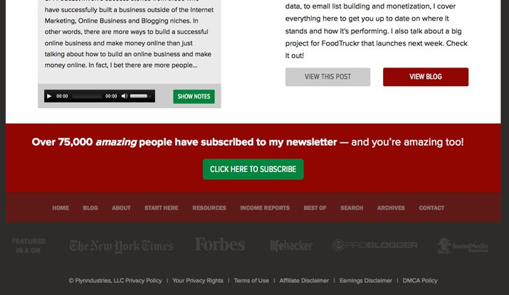
The Smart Passive Income Blog does a great job with a multi-level footer. There is a call to action, then site links, then a sub-footer with media mentions in a faded color, followed by site disclaimers and policies. The levels of navigation provide depth in the footer and make it easy to skim and click through.
15. Don’t Underline All Those Links
The biggest footer mistake? Allowing links to have underlines. There are still a large number of websites with underlined links in the footer. This dated technique is not appropriate for a modern site design.
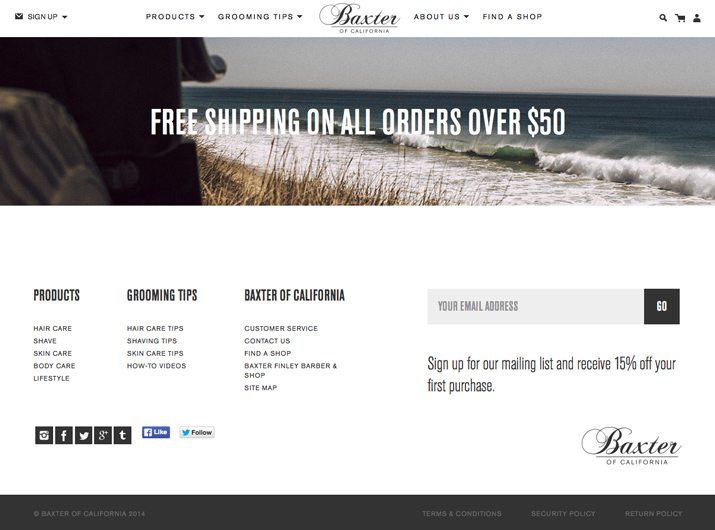
Baxter of California has a footer that is clean and includes a lot of links. It does not look cluttered thanks to simple linking, without all those pesky underlines.
Conclusion
A footer can say a lot about your website. It tells users who you are, what they can do and how to get around your webpage. It also shows subtle things about you as a designer such as attention to detail and ability to work in a small space.
The footer is an important part of the design. Pay attention to it. Make sure to include the right mix of information, design elements and usability to get the most of the lowermost space in every web design project.